Friday, February 21, 2014

Young Artists International Watercolor Society Contest 2014

What a great turnout for the 2014 IWS Contest.  Around 600 artists from 69 different countries participated in the contest.  Congratulations to the winners and to all who participated.

THE WINNERS OF THE INTERNATIONAL CATEGORY


THE WINNERS OF THE NATIONAL CATEGORY


THE RECIPIENT OF THE HIGH SCHOOL ENCOURAGEMENT AWARD


All entries are available for viewing at the 2014 IWS Contest Page

MEET THE JURY


WATERCOLOR BIENNIAL

IWS cordially invites all to join the International Watercolor Painting Biennial to be held on May 5-8, 2014 in Cappadocia, Turkey.  For more details, click on the picture link below.

Friday, January 25, 2013

Sunset Demo

A bit of a break from my flower paintings.

Sun / sky paintings are great for demonstrating traditional watercolor techniques.  That is when you use the white of the paper to lighten your colors instead of adding white pigment.  Transparent watercolors are used and the color white is created by leaving the paper unpainted.

The reference photo for this demo was provided by my friend Rhona Limcangco.  

I drew my guides lightly with a pencil.  I placed the horizon line lower, the sun moved to the left (off center) and marked where the reflection of the sun hits the water.  The blocked area of the sun will remain unpainted throughout the demo.


I am using a limited palette for this demo:  French ultramarine blue, cerulean blue, raw sienna, burnt sienna, Winsor yellow and towards the last part, some ivory black.

I started by painting around the sun outline with a very pale wash of raw sienna and Winsor yellow.  My initial washes are usually very, very light and just enough to define the guides.  I intend to erase all the pencil lines as soon as possible.  Graphite can dirty your colors.  Specially when using yellows, I find that pencil marks can become almost impossible to erase if glazed over with yellow paint.  The success of the illusion of a blindingly bright sun depends a lot on you being able to erase the pencil mark around the sun.  I got this idea while we were travelling one afternoon.  I often use the time when I am not the one driving to look for possible subjects for paintings.  I try to puzzle out how I can paint the objects and scenery that catches my fancy.  Always with a camera ready on hand, I was trying to take a picture of the sky with the sun peeking through the clouds at about 2 or 3 p.m.  Directly pointing the camera at the sun scene though only registered a big blob of light, no details.  Probably something you can shoot better if you have the more sophisticated cameras and the time to tinker with the controls.  But as I was using a point and shoot camera in a moving vehicle, the result was a light blinded picture.  So I did the next best thing.  Back to good old reliable observation with the naked eye.  Squinting, I could see the sun as a white hot disc with its shape defined by a still bright but less so sky.  And as I moved my attention farther from the source of light, the sky color gradually transitioned to its normal color.  Er, of course, I paid for this constant staring afterwards spending the next twenty minutes seeing violet afterimages wherever I look and had difficulty seeing when we finally got to our destination and gone indoors.  Staring directly at the sun is something I would not recommend to others as you can really damage your eyes but the lesson of the story is firsthand observation is still the best.  The knowledge gained from that experience I can now use when painting a better sun and sky for this demo.

Pencil marks removed.

Using the same colors I used for the sky but in a slightly darker shade, I placed a wash of color to define the water and beach areas.  Soften some of the edges by blending the colors in the areas together.  Take note of the beach area and water line specially on the left side.

To further enhance the brightness of the sun's reflection on the water, lighten the part of the horizon line directly below the sun.

For the clouds, I used a mixture of french ultramarine blue and burnt sienna to create the cloud shapes.  Nearer the sun, I made the clouds lighter in color.  Go darker as you move away from the sun.  The "silver lining" or halo around the clouds you can create the illusion of by painting an outline with a thin margin of space around the clouds using the base color of the sky in that area.  Above the clouds, I used cerulean blue, darkening around the cloud outline and blending with clear water towards the sun to create a subtle transition.  Below the clouds and near the horizon line, I darkened using Winsor Yellow to warm the area nearer the sun.

I dry completely between applications to keep my wash passages from disturbing the earlier paint layers.

Two methods for darkening the sky:  One is applying french ultramarine to the top and sides and then blending it with clear water to lighten it as you go towards the sun area.  The other method is what I used.  I applied clear water on the sky area, making sure to work around the sun spot and the clouds' silver linings, and then dropped darker colors at the outer corners.  This takes timing.  I usually wait for the water to be absorbed to the point where only a very thin film of water remains on the surface of the paper.  This sheen is more apparent when you look at the paper's surface from a certain angle.  You can see this "sheen" in the picture on the right.  Instead of using the brush to guide the colors, I use gravity to direct where I want the colors to go to.  Yes, you can paint by tilting and moving your paper about.  It will even give you a softer gradation of colors than if you were to use a brush.

Added more yellow to the water and darkened the water areas using more french ultramarine and ivory black.  Used the reference photo as a guide when placing the wave lines.  Beach area also darkened with more burnt sienna grayed with french ultramarine and ivory black.

Defined the clouds some more by darkening outer clouds.

Horizon line was softened by darkening the sky above the horizon and graying the leftmost and rightmost areas with ivory black.


Finally, people and boat silhouettes were added using ivory black.  I decided to do away with the viewing hut as it will surely compete for attention with the sun if left in place.

Does looking at the sun in the painting make you want to squint?  It still is just the white of the paper.  :D

Thank you for looking and reading.

Friday, January 4, 2013


Purple Rain

14.5 x 24


Article to follow.


Tuesday, July 17, 2012

International Watercolor Society

What a treat I got in the mail.  A packet from Turkey arrived and it contained my copy of the IWS Catalog and a certificate of appreciation too.


Thank you very much IWS.  What a great honor for me.  Thank you not just for the experience but also because I met and gained new friends who share the passion for the medium.

About IWS - International Watercolor Society


The catalog is not yet available for ordering but is available for viewing online.  Catalog cover pic will take you to the fb album.  A bit of correction.  The 2013 is not yet out.  This is the 2012 IWS catalog.

IWS Catalog

My painting that got included.
Before I go, let me share with you this video collection compiled by IWS from participating artists all over the world.  Watercolor is really a very expressive medium able to accommodate a multitude of styles.

2012 IWS Jury Committee


Saturday, June 30, 2012

Red Hibiscus… With Girl


KS00087
12.5 x 15 inches
watercolor on paper

Kidding!  Haven’t decided on the painting’s title yet.  Was just playing around with the article title and thought I probably should acknowledge that I am aware some of you may be thinking that I am stuck on hibiscuses with them being mostly my output lately.  Partly true.  Could not help myself.  I had not realized there were so many color varieties for this flower that it makes me want to experiment with the color mixes whenever I get my hands on a new variety.  The second reason is because I get requests for hibiscus paintings.  Win/win for me.  I get to paint what I like often.

ABOUT THE PAINTING

Let me introduce you to Morgana, my niece.  She was accompanying me around their garden as I scouted for flowers  when the reference photo for this painting was taken.  Not many are probably aware but perfect reference photos do not usually just happen by chance.  Most blooms have a mind of their own and usually pose themselves so that they stand out like divas from their peers.  Perhaps a quirk of evolution... survival of the prettiest.  More often than not, as I like painting flowers in their natural setting, I would find myself fixing and posing the flower/s on the spot.  I was doing exactly that with the red hibiscus here.  The flower was quite large and looked velvety red.  it was also the sole bloom at that time from that particular plant.  So when my niece suddenly placed herself in front of the camera and pulled on this bloom, my first reaction was to panic.  I have just spent several minutes tucking this branch here, this leaf there, and I thought she was going to snap the flower off thinking to help me by just handing the thing to me.  So I was saying…no…no…no… and then realized she was carefully posing with it.  Feeling relieved, I took her picture.  When I looked at the camera display, I realized, wow... she’s quite a photogenic kid.  The lighting seemed perfect too.  Sunlight was coming from behind the foliage highlighting her hair in places and there was a lot of reflected colors.  It is a good thing she’s not shy around the camera and was game when I gave her instructions… look this way, hold, now smile when I tell you to… the kid is a natural model.  I exercised artistic license though and later changed her ornate headband to a plain white one when I painted it.  She was also wearing a black top with a checkered green and peach pattern which I changed to plain unadorned white for two reasons:  To make sure the outfit would not pull attention from her face and also because the lighter color would suit a child better.  Originally, I was planning to use a very simple background for this painting.  So it would be just Morgana and the red flower.  But as I started to put the initial washes for the arm that she was holding the bloom with, I realized her body position and gesture would look unnatural and strained if I did not include into the painting a hint of why she is posed like that.  So I included the leaves and the upper part of the plant that the flower is attached to.  At the same time, I was aware that if I made the plant too detailed, it may compete for the viewer’s attention.  I used more definition for the leaves specially the one on top that was pushing against her hair.  I just hinted at a branch and some leaves on the lower right side just to suggest an anchor for the rest of the plant.  Subtle enough not to lead the viewer’s eye out of the painting.


PAINTING MORENA

I finished the sketch for this portrait and had the drawing already transferred to the paper months ago.  But I only put paint to paper two weeks ago.  It was because I was at a loss as to how to paint our skin color.  Most instructional books have color suggestions for fair and dark skin but not our race's usual color which is "morena" - a sort of golden brown.  I have just finished another painting, Red Hibiscus, when I noticed I still had a lot of clean colors left over.  It made me remember a conversation I had with my friend Erika who is also an artist.  She shared her morena color with me.  While what I had on the palette was not exactly the colors she shared with me, I got the concept from it.  I remembered Morgana's drawing and decided if I was to swim in cold water (having painted my last portrait so long I feel like I've forgotten everything), better to get over the initial shock by jumping right in.

The idea is a basic brown mix to which you add blue, red, or yellow depending on whether you will use it to highlight, darken or just to add a glow.  This method may also remind you of Jan Kunz's method and you are right.  She is one of my earliest influences.  I received my knowledge about crevice darks, reflected colors, highlights and general watercolor knowledge from her books and videos.  I highly recommend her instructional books and videos.  Back to my color mixing.  I made my basic brown mix from cadmium orange, french ultramarine blue and permanent alizarin crimson.  I used for my yellow, red and blue mixing colors cadmium yellow, permanent alizarin crimson, french ultramarine blue.  But have fun experimenting with different colors.  I am reserving Erika's exact trio for my next portrait painting.  Thank you Erika!

RED HIBISCUS

KS00086
Red Hibiscus
8 x 8 inches
watercolor on paper
Framed

This red hibiscus will be auctioned off this September for a cause my high school batch is supporting.  Batch 88, Assumption College.

COLOR PALETTE
Colors used for Morgana's portrait and for the Red Hibiscus are:  Cadmium yellow, cadmium orange, permanent alizarin crimson, French ultramarine blue, permanent sap green, ivory black, winsor violet, and winsor green.

My colors were a combination of transparent and semi-opaque colors.  The trick for  not producing “mud” is patience.  I dry completely between layers.

Another thing I noticed is that some of the colors look different on the photograph.  When viewed in real life, the flesh tones in the painting look very soft and well blended.  However, in the photograph, I can see color patches with distinct edges overlapping.  I am already aware that some colors like Cobalt blue behave this way in front of the cam.  This probably is related to some colors being transparent and some opaque.

Well that is it for now.  Til next.


Erika Nelson’s blog
http://artbyerika.blogspot.com/


Thursday, April 5, 2012

Up For A Challenge


Red Jade Vine

KS00085

12 x 16 inches

watercolor on paper
Collection of Librada Dela Fuente
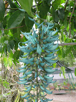


The name is actually a misnomer as the red jade vine is of a different species (Mucuna bennettii) from the jade vine (Strongylodon macrobotrys).  Beautiful and not so commonly found, both are sought after by garden enthusiasts.  These type of flowering vines are most often used to fill and decorate shaped frame structures for walkways.  They provide very good shade.

We have both the jade vine and the coral vine (another name for the red jade vine) now in our garden courtesy of Kakang Badeng (grandaunt) who is a collector.  It is from her garden that I get some of my more unusual flower references.
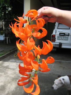
Painting this coral vine was quite a challenge.  It was several months in the planning.  First, because it is a seasonal bloomer.  When Kakang Badeng asked me if I could paint it from a picture she took, I said I will have to see the coral vine closer up and in the natural setting.  This is one of those blooms whose color cannot be captured by photographs well.  The red orange coloration is so bright that the camera perceives the individual blooms to be almost one solid color.  It becomes difficult to distinguish individual structure and detail.  The chandelier-like formation of the combined blooms also can be limiting in that you are more or less stuck in having to show it hanging down otherwise, it might not become recognizable.  I was able to take home a flower cutting the next time it bloomed.  Lola had one of her gardeners climb and get a sample so we can see it closer up.  At home, my sister had to hold the stem with a forceps because the stem has spicules.  Not a very nice feeling when you get the sharp, tiny spikes in your fingers.  I had to use masking tape to get mine out.   But see how bright the coloration is.  It is even more beautiful "live" because you see subtle differences within the orange color - hint of red, green, yellow and even violet.
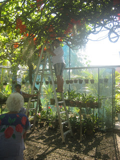
As I was studying the coral vine and making notes, I realized it would be easier composition-wise if I placed it in its natural setting.  I can use the background to add more interest.  I mentioned to my lola that I need more information.  I will need to see how the flower is attached to the vine, how the leaves are oriented, etc. (more from curiosity and the need to see it - orient it logically in my brain than the actual need to paint details).  And that is how I found myself atop a tall aluminum ladder the next time me and my sister visited.  Be careful what you wish for, you just might get it.  :D   When we got there, this ladder was already in place complete with an assistant who would make sure it will not topple over.  As I was climbing the ladder with my knees shaking not just from the height but the feeling that the ladder might not take my weight, I looked down and saw Kakang Badeng.  She was so confident I could do it that it convinced even me.  So who says there is no thrill and adventure in painting.  This passes for the equivalent of bungee jumping when you get to my age.  :D

A BRIEF INTRODUCTION TO COMPOSITION, THE OLD SCHOOL WAY

How I planned the painting itself can be summarized by this simple illustration.

I placed the subject (large orange oval) off center, left and higher up.  The smaller orange ovals add interest but don't detract from the main subject.  The function of the satellite ovals is to add interest but at the same time it also acts as a pointer or reminder so that your attention is brought back to the more dominating large oval.  To make the background more dynamic, I angled it.  The green zone is for the vine branches and leaves.  Blue zone for the sky.  The large white area at the bottom which I will leave mostly blank will reinforce the illusion that the bloom is hanging.


WORKING WITH PHOTOS

Here is how it looked from the top of the ladder.  You have vines crisscrossing, some as thick as my wrist, others thin as a finger.  The greenhouse has a metal framework which the vine uses for support.  The leaves are mostly outside and on top of the greenhouse.  Sunlight pierces through gaps and you can see glimpses of sky in the spaces.  See how photographs are great tools for memory or recollection.  Now to paint as if you're doing it plein air, don't get too caught up in the photo but distill the essence or principle of the thing and use it to suggest realness.
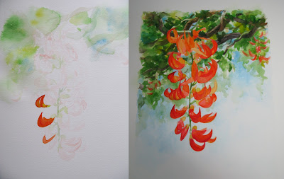


I had fun when creating the background dropping in colors and creating ghost branches.  I had so much fun I forgot to photograph the process in between these two stages.  Sorry.  Sometimes you get too caught up with an idea, you forget about documenting.  But the idea is to leave spots of areas lighter in color among the branches.  Later, I would color these the same blue as the sky.  The branches were semi-detailed in some spots and vague in others.  Some areas, I covered with varying degrees of green.  I debated against painting realistic detailed leaves because it will compete with the blooms and also because I wanted the illusion that you're viewing this from a distance.  At that height and distance, either you would focus on the bloom or on the leaves and vines.  That is how the normal human vision works.  I want the viewer to think it was his idea to focus on the blooms so I left the detailing mostly on the flower itself.  Try it, see how even when you consciously try to walk your eyes around the painting, you would find your eyes straying towards the main flower.  Last, on the finished painting, you would notice that I signed my name very lightly with the same blue I used for the sky.  I wanted the signature to be as unobtrusive as possible.  I was thinking of not putting it in at all but because I will not be supervising the framing of this painting, I have a feeling that the framer might crop the large white area thinking to save space.  Putting it in this way, they would feel compelled to include the signature.  If this blank area was shortened, you will lose the feeling that the bloom is suspended high up.

So that is one way to do the old school way of composition.  These days, we do not really adhere to the "rules" but sometimes it is good to know the basics.

Thank you for dropping by.


Friday, February 17, 2012


"Saging-sagingan"
KS00084

10.5 x 13.5 inches
watercolor on paper

Gone green lately.  Have been a bit busy in the garden.  And congratulate me, only half the plants I have repotted keeled over.  That is quite an improvement from my 007 status in the plant world.  I also got bougainvilleas in multi-colors so you can probably guess what my next projects will be.  And yes, the bougainvilleas are expected to survive 100%, I was only allowed to watch when they were being replanted in the bigger pots.  :D

About the painting's title "Saging-sagingan", literally translated it means mock bananas or fake bananas.  It is the local name for the plant Heliconia psittacorum (also known as false bird-of-paradise, parrot's beak).  I noticed ever since being told the local name, I can't see the parrot's beak anymore but keep seeing bananas, bananas.  The leaves of the plant also look like banana leaves growing upright from the ground.

For this painting, again, I used a limited palette and used the whiteness of the paper to get lighter colors.  One advantage of using a limited color palette is it makes it easy to achieve cohesiveness in your paintings.  For example, to get a darker green I added a bit of violet to the sap green.  For other parts of the leaves, I added orange or red to the green to get different shades of green.  For the shadings in the "bananas", I used mixtures of green and blue.  The red got darker or lighter with the addition of violet and orange, etc. Even though the colors look distinctly blue, distinctly green, distinctly red or yellow, they have parts of the other colors in them that later when you take it all in together, you know the colors fit.

My palette for this painting:
(W&N)  permanent rose, Winsor yellow, Winsor orange, permanent sap green, Winsor green, cobalt blue, cerulean blue and Winsor violet.


Thank you for dropping in.