

Red Jade Vine
KS00085
12 x 16 inches
watercolor on paper
Collection of Librada Dela Fuente

 The name is actually a misnomer as the red jade vine is of a different species (Mucuna bennettii) from the jade vine (Strongylodon macrobotrys). Beautiful and not so commonly found, both are sought after by garden enthusiasts. These type of flowering vines are most often used to fill and decorate shaped frame structures for walkways. They provide very good shade.
We have both the jade vine and the coral vine (another name for the red jade vine) now in our garden courtesy of Kakang Badeng (grandaunt) who is a collector. It is from her garden that I get some of my more unusual flower references.
 Painting this coral vine was quite a challenge. It was several months in the planning. First, because it is a seasonal bloomer. When Kakang Badeng asked me if I could paint it from a picture she took, I said I will have to see the coral vine closer up and in the natural setting. This is one of those blooms whose color cannot be captured by photographs well. The red orange coloration is so bright that the camera perceives the individual blooms to be almost one solid color. It becomes difficult to distinguish individual structure and detail. The chandelier-like formation of the combined blooms also can be limiting in that you are more or less stuck in having to show it hanging down otherwise, it might not become recognizable. I was able to take home a flower cutting the next time it bloomed. Lola had one of her gardeners climb and get a sample so we can see it closer up. At home, my sister had to hold the stem with a forceps because the stem has spicules. Not a very nice feeling when you get the sharp, tiny spikes in your fingers. I had to use masking tape to get mine out. But see how bright the coloration is. It is even more beautiful "live" because you see subtle differences within the orange color - hint of red, green, yellow and even violet.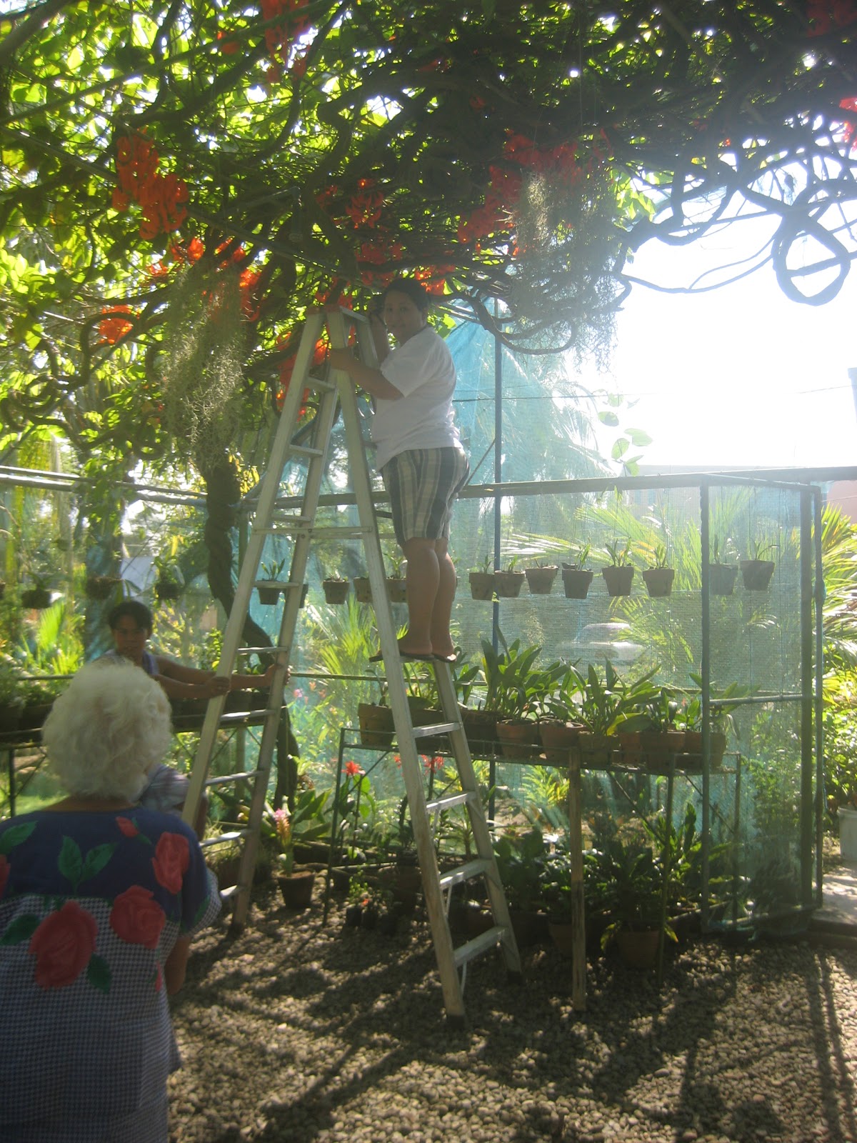
As I was studying the coral vine and making notes, I realized it would be easier composition-wise if I placed it in its natural setting. I can use the background to add more interest. I mentioned to my lola that I need more information. I will need to see how the flower is attached to the vine, how the leaves are oriented, etc. (more from curiosity and the need to see it - orient it logically in my brain than the actual need to paint details). And that is how I found myself atop a tall aluminum ladder the next time me and my sister visited. Be careful what you wish for, you just might get it. :D When we got there, this ladder was already in place complete with an assistant who would make sure it will not topple over. As I was climbing the ladder with my knees shaking not just from the height but the feeling that the ladder might not take my weight, I looked down and saw Kakang Badeng. She was so confident I could do it that it convinced even me. So who says there is no thrill and adventure in painting. This passes for the equivalent of bungee jumping when you get to my age. :D
A BRIEF INTRODUCTION TO COMPOSITION, THE OLD SCHOOL WAY

I placed the subject (large orange oval) off center, left and higher up. The smaller orange ovals add interest but don't detract from the main subject. The function of the satellite ovals is to add interest but at the same time it also acts as a pointer or reminder so that your attention is brought back to the more dominating large oval. To make the background more dynamic, I angled it. The green zone is for the vine branches and leaves. Blue zone for the sky. The large white area at the bottom which I will leave mostly blank will reinforce the illusion that the bloom is hanging.

Here is how it looked from the top of the ladder. You have vines crisscrossing, some as thick as my wrist, others thin as a finger. The greenhouse has a metal framework which the vine uses for support. The leaves are mostly outside and on top of the greenhouse. Sunlight pierces through gaps and you can see glimpses of sky in the spaces. See how photographs are great tools for memory or recollection. Now to paint as if you're doing it plein air, don't get too caught up in the photo but distill the essence or principle of the thing and use it to suggest realness.

So that is one way to do the old school way of composition. These days, we do not really adhere to the "rules" but sometimes it is good to know the basics.
Thank you for dropping by.


