Showing posts with label watercolor florals. Show all posts

Wednesday, January 4, 2012

Sunlit Yellow Hibiscus

Finally, regular internet service is back on.  Thank you friends for waiting with me.  It has been quite a while but I am hoping to make it up this year with all that I have promised to do.  Thank you for the patience.

Finished this hibiscus early December last year but could not post it or the painting progress online.  Aside from losing internet service, this painting was to be a surprise gift for my friend Cathy from her husband.  I usually do not do the same color flower in a row but when Noel and I were discussing what kind of flower Cathy might like and at the same time what would compliment the color scheme of their house best, we agreed on a yellow hibiscus.  It helped that the last time they were over at our place several months ago, Cathy liked the yellow hibiscus I just finished for Gigi.  


Sunlit Yellow Hibiscus
19.5 x 16.5 inches
watercolor on paper
KS00083

Thank you very much Noel and Cathy for the support and for letting my work be part of your new home.


Sunday, June 26, 2011

How To Paint Bougainvilleas, Part 1


Bougainvilleas are a favorite subject of mine.  I'm attracted to the color possibilities and the detailing one can go crazy with.  I would admit that part of the reason I started painting it was because of the challenge.  It looked so intimidating to paint that I felt compelled to unravel the mystery.

Whenever I find myself facing an insurmountable task or project, my first course of action is to chop things up into manageable pieces.  If something looks complicated, I try to simplify.  It also has to do with a learning limitation I have.  I have difficulty with memorization.  But I'm good with concepts and once I get the rationale behind something, my recall is good.  That's part of the reason why I take so long to do things the first time.  For plants and flowers, I go nerdy and do surgery.  I like to see how things work or how things are put together.  Seems excessive just to draw a flower.  Time consuming, yes. But I think of it as time well spent because it helps make successive paintings using the same subject easier.  If you've heard of the story of how an old master taught his students to paint by making them traverse five flights of stairs between their easels and their subject matter, then you might realize it is not really about memorizing the details but getting the concepts that should help them recreate something.  If you do the stair challenge yourself, you'll find that any detail you've tried committing to memory will have evaporated by the time you reach second floor.  Trying to catch your breath and keeping an image is a hard feat.  The objective is not to develop a photographic memory but to exercise the ability to synthesize the essence of something.  So for the bougainvillea lessons, I'll be familiarizing you with how the flower is put together in nature and at the same time will be posting the step by step of the painting process.  Hopefully, I succeed in imparting the essence of it. Mine is just one way to tackle the bougainvillea, I hope it helps make it easier and fun for you too.

Here is the drawing outline for this bougainvillea demo.

This is the basic unit of a bougainvillea cluster.  You have three modified leaves (often mistaken as bougainvillea petals because they are colored brightly like a flower's) that have mini flowers on elongated thingies.  One mini flower per colored leaf.  When formed well, the flowers' bases are erect and plumped up with a slightly cinched middle and hard ridged edges.  The ones that look like spent matchsticks are flower bases that have sustained damage and twisted as they developed.  The three leaves are joined at the base by their attachment to a single stem.  That will be shown on the next demo.


My first objective is to define the areas using very light washes of local color.  I do this because I intend to erase the pencil guides as soon as I can.  I do not like pencil marks on my watercolors (not because I'm mean and like making my viewers guess how it was put together (grin!)) but because I find my colors are brighter and clearer when they are free of graphite residue.  Remember to use a soft white eraser to minimize damage to the paper's surface.

If you're interested in the colors I used for this demo, they are rose madder genuine, permanent sap green, winsor lemon, cerulean blue, permanent rose and permanent alizarin crimson.  (Winsor and Newton).  You may use other color substitutes.  I only picked them because I happen to have small leftovers of the colors from past paintings.  For serious paintings, I always use a clean palette and fresh colors but I save leftovers from finished paintings for practicing with.

The ridges of the leaves are yellow in color but because yellow and pencil marks are a no-no, I left the areas where I picture the ridges to be blank.  Any yellow over pencil marks would make the pencil mark almost impossible to erase.  A phenomena observed by most artist.  So as a rule, using yellow for mapping is to be avoided if you intend to erase your guides later on.

I applied the rose madder genuine to the pink areas using mostly the tip of a no.6 round brush.  As if I'm dabbing spots on and leaving spaces in between.  The pink defines the areas but because they were applied unevenly and spottily, it will help with the illusion of convex textures on the modified leaves' surfaces.

When you apply the second wash over the entire leaf's surface, this will soften any hard edges you may have had in the first step with the spotty paint application. When this layer dries, because we used transparent watercolor, the texture underneath would show but would look more natural.  I also use this second wash to enhance the leaf's bending or foldings.  While the layer is in that state between wet and almost dry (when you tilt it, it still has that sheen or film of water), I drop in warm and cool versions of the local color to enhance the bending effect.  When it is almost drying, (state when you know your next paint application will have a limited spread but will still soften, I would add the yellow ridge lines.  That's because I imagined the central and radiating lines (the leaf's skeleton) to be yellow for this painting.  But if you want it to be another color, use your preferred color to define the leaf's framework.  In the picture, I used a liner brush.  You can see how I am able to add the line but at the same time it is soft enough in some places.  The lost and found lines make for a natural looking painting more than the severely defined lines you see most beginner's tend to make.
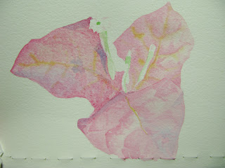
When you've finished putting the second layer on, your three leaves should more or less look like this.  Notice specially how on the leftmost leaf, the convex textures are almost forming itself.


After the previous layer has dried completely, I would now work on enhancing some of the shapes that emerged.  For the leftmost leaf, I applied just a slightly darker version of the pink to some of the edges on the "found" textures.  Check out specially the part nearest the flower.  It looked as if a lot of work went into creating the creases but that was just a few additions of defining paint.  Again, try not to use single hard lines but use the broken or "lost and found" line defining technique.  At this point, I've only used the colors rose madder genuine, winsor yellow and cerulean blue.  RMG for the local color.  The WY for the leaf framework (mixed in with a bit of RMG to warm it), CB dropped in on the wet RMG to simulate areas reflecting the sky.  Also a bit of the permanent sap green earlier for the flower stalks.  I started coloring thh right-most flower with a mixture of RMG and WY.

Now we start using Permanent Rose and Permanent Alizarin Crimson.  I start defining the flower stalks using PR mixed in with RMG.  I also used PR to add some defining lines to the leaf skeletons.  Again, use the broken line technique.  And if you're enhancing a previous broken line application, you enhance only 3/4 of that one's length.  The missing parts are supplied automatically by the viewers' brain as it tries to digest what it is seeing.  That's what we're stimulating by the way.  The human brain is a remarkable organ, it is always trying to be efficient.  We are able to process a lot of information because for some tasks, the brain has devised a way to process things faster.  For vision, it stores a lot of information.  We can take advantage of it in painting.  It creates solid lines out of broken lines.  Complete textures on areas.  Even mix colors - something the impressionists realized and took advantage of.   Etc.  Our aim is to stimulate the brain enough so that by the time you finished painting, the subliminal part of your viewer's brain is on hyper mode and it will be hypnotized into thinking this is a busy and stimulating painting... it is beautiful.  I like it.... I want to buy it.  Ok... ok... I haven't figured out how to compel your viewer into buying yet but someday, we'll get there.  (evil laugh!)  :D

As you near completion, you would notice, you're tweaking the painting less and less.  My last touches were made with permanent rose and alizarin crimson. Just minute enhancing on the leaf's skeleton and more definition for the flower stalks.

If this is a painting with a background, my next step would be on how to integrate the bougainvillea into the background.  We'll get to that in future demos.

I hope you enjoyed this one.  Thank you for looking.

Saturday, June 4, 2011

Bougainvilleas

It has been awhile since my last post.  I have been busy the past weeks taking advantage of the last days of the summer.  Very hot days with temperatures reaching as high as 36 degrees Celsius (96.8 F) in the shade.  Despite the heat, many trees and plants are in bloom.  Bougainvilleas are aplenty.  They seem to thrive in the heat.


Fuschia Bougainvillea
KS00081, 8 x 8 inches, watercolor on paper

Common colors of bougainvilleas are white, red, pink, fuschia, lilac, and orange.  The colored parts of the plant are not actually big petals but are specially adapted leaves.  People often mistake these colorful leaves to be the flower.  Not exactly, but close.  The bougainvillea flower can be found at the end of the colored stalk that protrudes from the colored leaf.   Yes, the very small white bloom.   

While the bougainvillea plant looks very chaotic and busy, there is actually an order to things.  People sometimes tell me I'm crazy to want to paint bougainvilleas.  They require so much detailing.  But you know, once you see the logic of its construction, it becomes do-able.  And it does not require as much detailing as you think.  Will do a step-by-step project of it one of these days.

This fuschia bougainvillea is from our backyard.  I hope the orange and the very dark fuschia bougainvilleas my father got for me take root.  We are well into the rainy season now.  I'm seeing more green leaves than colored ones last I checked.  Maybe that is their way of coping with rainy weather.

This painting has been sold.  
Affordable prints of it may be had at FineArtAmerica

To see more of my completed works:

Back to painting now.  Thank you for visiting.    


Sunday, February 20, 2011

Yellow Hibiscus

Yellow Hibiscus, At Twilight
19 x 19 inches
watercolor on paper
Feb 20, 2011

I already named this one Twilight Hibiscus but when I googled to see if grammatically, that is acceptable, not only did I find out that it is ok to use but that there are a lot of photos and art with the same name already.  So I rechristened this one Yellow Hibiscus, At Twilight.

Now why the fixation with the word twilight.  While I did read the vampire novel, I was influenced more by the time setting for this piece.  We have this not so usual yellow hibiscus in our garden.  We were told the mother plant probably came from Hawaii.  That would explain why it looks different from the local variety.  The blooms are bigger than normal and with more folding within each petal (reminds me of swag curtains).  The deep pockets or folding bring out the most unusual reflections.  Whenever I would pass by this plant in the mornings and in the afternoons, I would always stop to enjoy and marvel at how the sky and nearby objects get reflected on the bloom making its yellow colorful.  Trying to capture the moment on photo is almost impossible.  the brightness of the yellow dominates and the camera is unable to register the other colors even though they look so evident with the naked eye.  Then passing by one time, as the sun is setting, i realized that the other colors get more pronounced as the brightness of the yellow lessened with the approach of darkness.  When I saw a potential bloom one morning, I waited that afternoon for the right moment with my camera on a tripod.  I remember the incident clearly because the whole time I was afraid I would get dengue from all the mosquitoes biting.  And as the sun disappeared from the horizon, there, the perfect window of opportunity. And I was able to get some reference photos of this effect. The pictures were blurred but workable.  We usually get wind here in the afternoons and even with the tripod, if the subject is swaying in low light, it is almost impossible to get a clear shot.  But no matter, I got a good enough guide photo.  As for the detailing, I already had previous sketches and studies of this flower that I can use.  By the way, photos are very good at capturing the moment but they have limitations.  Without your own memory of what caught you about the scene, without a chance of actual observation of the subject, without mental notes on details and constructions, working from reference photos can even be harder than if you were to paint from real life.  Just that sometimes, when your subject has a short lifespan, as with most flowers, or at times when you cannot work on location or cannot take the subject home, a photo is a very useful tool for jogging the memory.  I would still recommend doing actual sketches from life.  Do studies of your intended subject.  It helps you see subjects in the round.  Drawing helps you see things with logic.  So and so has a bump here because the thing is connected to the... that kind of logic.  I would often dissect flowers to see how they are put together and find this exercise of drawing them from life very helpful.  You need not be that technical nor obsessive but sometimes it helps when you find yourself with a photographically accurate rendering that still looks flat or unreal.  The knowledge could help you fabricate details that can lead to better illusion of reality. Often, what you will manage to capture on film or file is so flattened together that some parts don't look natural anymore.  You will encounter objects here and there you can't logic the origin of.  Which is probably why it is better to work from reference photos you took yourself. Your memory can guide you and you can then weed away the unessential and add or augment what is absent but you think should be there.  There are times however that you may have to work from photos sent by others.  Most artist accept commission work and this is a great way to have supplemental income.  Anyway, another topic for another day.  How to use photo references.

I am happy to announce that this youngest child of mine is already sold.  She will not be lonely because she will be placed beside her sister, 2010 hibiscus (I still have yet to come up with a name for the quinacridone red/fuschia hibiscus).  Thank you very much Atty Gigi for giving them a good home.  First time also I worked following a theme.  Again another  potential topic.  How to do a series.  


That's it for now.  Thank you for looking.  

Tuesday, December 28, 2010

Pink Liliums, Using Warm Glazing To Recede Objects


Pink Liliums  
11 x 14 inches.
Watercolor on Paper.
Collection of Librada Dela Fuente

Finding flowers to paint can seem like an adventure sometimes.  There was this one time when I was so fixated on some cannas growing by the highway that I had to stop and take pictures.  I was so engrossed in taking reference photos that I did not notice there was a fence and a house behind the plants.  The owners called the local authorities fearing that I was scouting their house to rob. I had to do some explaining but it was a good thing that happened too because now I'm more aware of the surroundings and make sure to ask permission first before I even take out my camera.  I also would sometimes travel to a place I've been told grows this and that plant.  Even friends and families support me in my hunts for they would call me whenever they spot beautiful and unusual flowers where they go.  My father, specially, is very supportive. He would often drive for me when I'm on a flower hunt and even offers to buy cuttings of plants that he thinks I would be interested in.  I'm very lucky to have relatives who support me in my interest.  I have a grand aunt in particular who I'm very grateful to.  When she learned that I paint flowers, she opened her garden to me and would send me home with the car packed full of plants that she thinks I would enjoy growing and painting.  And when I say packed full, I mean trunk is full and my passengers even have plants on their laps and cramping their legrooms. I can't help but smile as I drive us home with our mobile garden.  I cannot thank lola Badeng enough for opening such a resource to me.  Imagine our surprise when a cutting she gave my parents years ago suddenly bloomed one day and it was a jade vine.  Quite rare in this day and age.  First time also for me to see a morning glory in actuality.  When I learned that she likes to collect paintings, I made this to gift to her.  She liked it very much and I'm very happy when next I visited her house that she placed it in a position of honor, next to a painting of Mrs Araceli Limcaco Dans.  Don't you just love your lolas (grandmas / grandaunts).

About this painting.   One technique to show depth of field is by varying the temperature of the different planes in your painting to simulate how the subject would look in real life as affected by atmosphere. Often, guided by what we see in nature and in landscapes, we have been told to use cool colors to recede objects and warm colors to advance them.  I have often used this technique in many of my paintings.  Cool colors like the blues and the greens are very good for receding the background and making your warm floral pop out.  For this one though, I decided to use warm glazing* on the background and kept instead the cooler version of pink on the main flower or focal point.  I think it works just as well in making the main flower stand out.  The important principle is to play the warm against the cool colors.  If you use cool glazing to push objects towards the back, use more warm colors on the objects in the foreground.  If you are opting for warm glazing, remember to use cool versions of colors on your foreground to differentiate or show that it is not on the same plane as the background.

*Glazing is the application of a watercolor wash over an object or area in your painting to diminish its prominence or brilliance. Transparent watercolors are very good for glazing as these allow you to still see what is under the paint film clearly.  Glazing is not just limited to watercolors.  The technique is also used with the other mediums like oil and acrylic but the important thing is the glaze has to be transparent to work.  Glazing is like using colored filter on your camera lens to alter the temperature of the object and background you are viewing.  But unlike with the camera, painting allows you to selectively target specific areas within your painting to use this "filter" on. Glazes may be done using cool or warm colors.  For a clean glaze application  (your objective is not to disturb the underlying layer), make sure the area to receive the glazing has already dried.  Use a soft touch when applying the wash.  A heavy hand may provide enough force to displace already dried paint. If using multiple glazes, make sure also to dry completely in between applications.


While the original Pink Liliums is no longer available, prints of it may be ordered at Fine Art  America.   Follow the link to its page.  http://fineartamerica.com/featured/1-pink-liliums-karen-sioson.html

Thank you very much for looking

Tuesday, October 19, 2010

Striped Orchids


30 x 40 watercolor I'm working on.   I mostly do my color mixing on the paper itself.  This one uses a limited palette:  Winsor Lemon, Permanent Rose, Permanent Sap Green, Cobalt Blue and Indanthrene blue. All winsor and newton artist tube watercolors on Arches cold pressed 140.

And here is the finished piece.

Friday, July 30, 2010

Water Hyacinth


30 x 36 inches
watercolor on paper

I love big paintings. If not for the factor of the heaviness of the frame, I'd like to try painting a 4 x 8 or 4 x 12 feet watercolor. That's the size of the plywood sheets we have here that I can use as a backing. Of course, there's the expense of the paint to consider but if I get a paint sponsor and have an affordable alternative for framing, I may just go for it. 

I usually choose the flower I'll be painting according to the color I'm fixated in at the moment. I can't really say I was in a blue mood because people tend to associate blue with sadness. When I'm painting, I can't remember not being happy or not enjoying it. From the sketching, preparing the paper, transferring the drawing to painting, the purposefulness is calming and gives me a happy feeling. I like challenges and figuring how things work. The problem is once I get how it works, I can be distracted by other projects... other colors. Hence, the several months that elapsed between start and finish. But I think it did good too. The colors sank really well into the paper. When I applied the finishing touches, the previous washes didn't get disturbed by the brush passages. I wasn't worried about environmental damage, I kept the painting well protected in the meantime. I remembered it when I realized I needed the backing for another painting I'm planning. I think not seeing it for a long time helped me see it in a new light too and I was able to solve things that have stumped me before.