A bit of a break from my flower paintings.
Sun / sky paintings are great for demonstrating traditional watercolor techniques. That is when you use the white of the paper to lighten your colors instead of adding white pigment. Transparent watercolors are used and the color white is created by leaving the paper unpainted.
The reference photo for this demo was provided by my friend Rhona Limcangco.
I drew my guides lightly with a pencil. I placed the horizon line lower, the sun moved to the left (off center) and marked where the reflection of the sun hits the water. The blocked area of the sun will remain unpainted throughout the demo.
I am using a limited palette for this demo: French ultramarine blue, cerulean blue, raw sienna, burnt sienna, Winsor yellow and towards the last part, some ivory black.
I started by painting around the sun outline with a very pale wash of raw sienna and Winsor yellow. My initial washes are usually very, very light and just enough to define the guides. I intend to erase all the pencil lines as soon as possible. Graphite can dirty your colors. Specially when using yellows, I find that pencil marks can become almost impossible to erase if glazed over with yellow paint. The success of the illusion of a blindingly bright sun depends a lot on you being able to erase the pencil mark around the sun. I got this idea while we were travelling one afternoon. I often use the time when I am not the one driving to look for possible subjects for paintings. I try to puzzle out how I can paint the objects and scenery that catches my fancy. Always with a camera ready on hand, I was trying to take a picture of the sky with the sun peeking through the clouds at about 2 or 3 p.m. Directly pointing the camera at the sun scene though only registered a big blob of light, no details. Probably something you can shoot better if you have the more sophisticated cameras and the time to tinker with the controls. But as I was using a point and shoot camera in a moving vehicle, the result was a light blinded picture. So I did the next best thing. Back to good old reliable observation with the naked eye. Squinting, I could see the sun as a white hot disc with its shape defined by a still bright but less so sky. And as I moved my attention farther from the source of light, the sky color gradually transitioned to its normal color. Er, of course, I paid for this constant staring afterwards spending the next twenty minutes seeing violet afterimages wherever I look and had difficulty seeing when we finally got to our destination and gone indoors. Staring directly at the sun is something I would not recommend to others as you can really damage your eyes but the lesson of the story is firsthand observation is still the best. The knowledge gained from that experience I can now use when painting a better sun and sky for this demo.
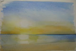
Pencil marks removed.
Using the same colors I used for the sky but in a slightly darker shade, I placed a wash of color to define the water and beach areas. Soften some of the edges by blending the colors in the areas together. Take note of the beach area and water line specially on the left side.
To further enhance the brightness of the sun's reflection on the water, lighten the part of the horizon line directly below the sun.
For the clouds, I used a mixture of french ultramarine blue and burnt sienna to create the cloud shapes. Nearer the sun, I made the clouds lighter in color. Go darker as you move away from the sun. The "silver lining" or halo around the clouds you can create the illusion of by painting an outline with a thin margin of space around the clouds using the base color of the sky in that area. Above the clouds, I used cerulean blue, darkening around the cloud outline and blending with clear water towards the sun to create a subtle transition. Below the clouds and near the horizon line, I darkened using Winsor Yellow to warm the area nearer the sun.
I dry completely between applications to keep my wash passages from disturbing the earlier paint layers.
Two methods for darkening the sky: One is applying french ultramarine to the top and sides and then blending it with clear water to lighten it as you go towards the sun area. The other method is what I used. I applied clear water on the sky area, making sure to work around the sun spot and the clouds' silver linings, and then dropped darker colors at the outer corners. This takes timing. I usually wait for the water to be absorbed to the point where only a very thin film of water remains on the surface of the paper. This sheen is more apparent when you look at the paper's surface from a certain angle. You can see this "sheen" in the picture on the right. Instead of using the brush to guide the colors, I use gravity to direct where I want the colors to go to. Yes, you can paint by tilting and moving your paper about. It will even give you a softer gradation of colors than if you were to use a brush.
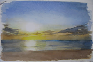
Added more yellow to the water and darkened the water areas using more french ultramarine and ivory black. Used the reference photo as a guide when placing the wave lines. Beach area also darkened with more burnt sienna grayed with french ultramarine and ivory black.
Defined the clouds some more by darkening outer clouds.
Horizon line was softened by darkening the sky above the horizon and graying the leftmost and rightmost areas with ivory black.
Finally, people and boat silhouettes were added using ivory black. I decided to do away with the viewing hut as it will surely compete for attention with the sun if left in place.
Does looking at the sun in the painting make you want to squint? It still is just the white of the paper. :D
Thank you for looking and reading.

 I have a lot of styrofoam fruit boxes lying around from my hydroponic lettuce project. These are the containers most grapes come packaged in. Most fruit stands will be happy to sell them to you for Php 20. I did a bit of research a while back on whether styro is safe for use in hydroponics and from what I had read realized that I may have a use for it even in watercolor painting. Learned styro does not have acid or base properties. It is also basically inert or stable. Perfect material for making watercolor paper stretcher support.
  You will need a sharp cutter and a metal ruler to cut out the rectangular panel on the bottom and top of the box.


 With sandpaper I wrapped around a box of soap, I smoothed the surfaces and sides of the stretcher. Even did a bit of beveling and rounding of sharp corners. Wear a face mask when you do the sanding. You would not want to get styro dust into your respiratory system.