Saturday, January 14, 2012

Make Your Own Watercolor Stretcher Board 2

Ever wished you can order gator boards in custom sizes?  Love those boards but they come only in fixed sizes.   I have cut some of them to make it more convenient for me when painting in smaller, non-standard sizes which I find myself repeatedly favoring.  But how to add two or more together to get a bigger surface to stretch on, that is a challenge.  The problem is you would get a ridge where two board edges meet and that might cause a permanent indentation on your watercolor paper.  These boards also have more noticeable bending or bowing the bigger you go (due to the paper pulling as it shrinks) so added support will be needed if you plan to make bigger stretcher boards out of them.

I have been experimenting over the last months using whatever materials I have around.  I dared not use the gator boards for the experiment because they are a bit expensive here so I used instead foam core boards.  At first I used illustration board as a backing to the foam core boards with the result that the first time I tried stapling paper on it, I ended up yelping.  The staple ends poked through the foam core board and the illustration board and into my palm.  Back to the drawing board.  Well, after trying on different supports and testing them out, I have come up with this final design.  So far, so good.  Will give you my review on how it performed at the end of this article.

Materials for this watercolor stretcher board:
  • Plywood (at least 6 mm thickness).
  • Paper tape.
  • Elmer's glue (carpenter's glue).
  • Foam core board.
  • Acrylic Gesso.
  • Brush for gesso application.

Directions:

Cut the foam core board and the plywood that you will be using as backing to your desired specifications.  I find it best to measure and cut the plywood first and then use that as a template for cutting the foam core later.  Easier to trim foam core than to trim excess plywood.

This is optional but I like giving the plywood backing some finishing.  You can use paint, sandpaper or treatments you can buy from the hardware to give the backing some finishing but my preference is paper tape.  One reason is when you do a double layer of it at the back, it sort of softens the backing.  I have appropriated our seldom used dining room at the main house as my studio because I get good lighting there.  I'm very conscious of abrasive, hard, sharp surfaces because they may scratch the glass top of our dining room table.  With the paper backing, I am not so afraid to rotate the board while I am working on it.  I like how the paper backing also prevents me getting splinters from the wood

Shown in the picture (above,right) strips of paper tape applied side by side onto the plywood. I cut them longer than the length of the plywood so I can fold them over and get a neat paper covered edge. After this layer dries, I place another layer of paper tape but position them perpendicular to the first one so I would get paper covered edges also on the last two bare sides. (If first layer is lengthwise, apply the second layer crosswise). Allow the paper tapes to dry completely and then turn the board over.


Put a liberal amount of glue on the inside surface of the backing board

Spread the glue evenly.  One reason why I keep some of the used prepaid phone cards.  They are very handy when you're spreading glue.
Place the foam core board onto the backing board and let dry overnight.  For better adherence, I would turn the board over, making sure that the surface I am putting on has nothing that will mar the foam core board's surface.  Then I use heavy books to weigh it down.  I forgot to take a picture when I did it so I recreated the scene but used fewer books.  There were a lot more books than these but they were heavy to lug around and I have already put them back.  But you get the idea.


Last, put several coats of gesso on the surface of the foam core board and on its side to seal it and make it water resistant (depends on how many layers of gesso you put on).  Do not forget the sides.  Gesso acts as a protectant or buffer against the elements and your foam core board would last longer if its inside is not as exposed to air and water.  It also is acid-free so even when you place wet paper over it, you will not be exposing your watercolor paper to acid you normally do when you get your paper in direct contact to wet wood.


Close up of the board's side showing why you need to cover it up with gesso too.  The exposed part will turn yellow and brittle over time.  The gesso will hopefully delay this a bit.  The board should give you extra years of service when you take precautions.


Tada!  With paper stretched on it.  Ready for painting.  (Of course, I let the gesso dry completely for several days before stretching on it.)


The review:

What is good about it:
  • You can custom make it almost any size.  Foam core is available at size 30 x 40 here so you can make a stretcher board as big as that.
  • With the plywood backing, it is not as prone to bowing.  This board I just made is 40 x 18 inches. When paper I stretched on it started drying, I only got slight bowing... almost negligible.
  • It is reusable.  You only need to invest time in it once, when you make it.  Although I did put another coat of gesso on a previous one I've just taken a painting off to plug the holes left behind by the stapler.  Still it looked pretty much intact and the surface was even despite the holes.
  • Not so expensive although quite time consuming.
  • The foam core layer took in the staples better.  I did not get that much shock on the wrist stapling on it.
What needs improving:
  • It is heavier with the plywood backing.
  • Not sure if it is due to the wet weather last month but I noticed that I needed a longer drying time in between sessions of painting.  Clay surface versus gessoed.  The clay surface of gatorboards seems able to dry the underside of watercolor paper faster.  This needs investigation.  I'm hoping maybe if the correct thickness of gesso is achieved, this will improve.  
I still favor using the commercially prepared gator boards when the painting I'm planning to do fits its dimensions but for the unusual formats, I think I did good with my DIY board.

Now if all of these seem very labor intensive and you have money to spare, you can always get thicker paper that will not need stretching.  :D

Thank you for reading.


Wednesday, January 4, 2012

Sunlit Yellow Hibiscus

Finally, regular internet service is back on.  Thank you friends for waiting with me.  It has been quite a while but I am hoping to make it up this year with all that I have promised to do.  Thank you for the patience.

Finished this hibiscus early December last year but could not post it or the painting progress online.  Aside from losing internet service, this painting was to be a surprise gift for my friend Cathy from her husband.  I usually do not do the same color flower in a row but when Noel and I were discussing what kind of flower Cathy might like and at the same time what would compliment the color scheme of their house best, we agreed on a yellow hibiscus.  It helped that the last time they were over at our place several months ago, Cathy liked the yellow hibiscus I just finished for Gigi.  


Sunlit Yellow Hibiscus
19.5 x 16.5 inches
watercolor on paper
KS00083

Thank you very much Noel and Cathy for the support and for letting my work be part of your new home.


Friday, December 9, 2011


My apologies for the long interval between my last post.  It took some time for me to recover from the loss of my faithful sidekick, muse and studio companion - Doodle, my pitbull daughter.  She died last July.  She lived to be more than twelve years old, around 62 in dog years.  A very old age for a pitbull, I was told, but little consolation to me as I was hoping she would live to be a hundred.  To say that I was devastated by her passing is an understatement.  I started and threw away many paintings in the weeks and months that passed.  Somehow, my paintings were ending up either too dark or too sombre, and it was adding to my depression.   But weird how sometimes it takes a tragedy to bring some focus.  I have been putting off writing my artist statement not because I do not know it but because I could not put into words what I was feeling and thinking.  The alone time forced me to do a lot of introspection.  I can work on the statement now.

To combat grief, I busied myself scouting and sketching possible subjects.  I made studies for portraits and landscapes.  I also got busy experimenting and thinking up tools to help me with painting and framing.  I had to make myself go out into the garden because for the first weeks, I could not.  My dog was always accompanying me whenever I am out taking pics and so it was hard remembering.  Later, I entertained invites to visit relative's gardens.   It was partly to remind myself that life is still beautiful.  It was also in acknowledgement that while I could not paint then, I knew I would get back to it eventually.  The love for painting is always there and so I continued collecting references and continued to be on the lookout for unusual plants.  I also learned a new skill with my sister, medical transcription.  A backup in case I don't ever get my painting mojo back.  Met a lot of good people and made new friends  :D

I am back to painting again.  Almost finished with two new ones.   Anyway, just wanted to say hello and to give a little explanation for the absence.

A preview of what's to come.  An improved DIY watercolor paper stretcher using locally available materials (Philippines).  How to "wick" your frames to improve protection against damp.  As well as the usual painting projects.

Again, my heartfelt appreciation.  Thank you very much for sticking around.

Wednesday, July 6, 2011

Troubleshooting Paper Problems: When The Sizing Goes Bad.

Was rummaging through my old stuff and saw this discarded painting.  Perfect illustration for explaining stale sizing.


I have this habit of setting aside half-finished paintings when I get that feeling that something about it is off.  "Aha!" moments sometimes come when you've stopped obsessing over something.  Sometimes it would take me days or weeks before I would get back to a particular painting.  This one somehow worked its way to the bottom of my pile and I forgot all about it.  Almost a year has passed since I last touched it.  When I tried working on it again to finish it, spots started appearing wherever I wet the paper.

Reminded me of salt effects.  This one however, is caused by sizing gone bad.  We have touched a bit on sizing in a previous post.  (Watercolor Papers and Sizing).  But basically, the idea behind sizing or the addition of gelatin to watercolor paper during its production is to make the paper more workable with watercolor.  Sizing allows you better control over your watercolor as it decreases the tendency of the paper to absorb liquids and paints like tissue paper.  Between the paper pulp and the gelatin, the gelatin would be the first to go stale with old stock paper.  Signs of this would be the appearance of spots that don't go away after a wash or after an application dries.  Another would be when you discover areas that resist any application of paint you put down on it. 

There are several ways to hasten the deterioration of the sizing.  As demonstrated in this ruined painting, one way is by wetting a painted watercolor that has lain undisturbed for months.  You can also hasten the deterioration of new paper using the same principle.  The moment you wet a watercolor paper, its sizing gets disturbed. Maybe water acts as a catalyst.  This is the reason why you are advised not to stretch paper in big batches.  Stretch only what you think you will be able to use within 2 or 3 months.  That's just my estimate.  In our weather where heat can be more than the usual, it is always more prudent to stretch only what you think you will use.  The window of usability may be different in your environment and you should let experience guide you.  

A sign that this was not bad paper to begin with is how the undisturbed, previously painted part is free of spots.  Check the picture.  You wouldn't know that the paper's sizing has gone bad if you do not re-wet the paper.  When you find yourself itching to touch up a painting years after it is finished, remember what happened here.  
Not all old stock paper go bad.  I use Arches cold pressed watercolor paper in rolls.  One of the most economical way of buying paper is by buying it in rolls.  Because you cut to size, you minimize wastage of excess paper.  As long as you do not get the roll wet and observe proper storage, the paper stays usable for years.  Proper storage includes storing it in its original wrapping and in the box it came in and with the crumpled paper fillers still inside.  Do not put this container/box in an area prone to dampness such as near windows, bathrooms, basements. Also keep it away from direct heat or sun exposure so the paper inside does not get heat-baked.

You do need to recognize what stale sizing on paper looks like, specially when you like to take advantage of art supplies on sale.  Some stores put their older stocks on sale just to move the items and to make way for newer supplies. Some of these discounted paper will still be good for use but many might have sustained handling or storing damage.  For this reason I prefer to spend on paper and get new stocks.  You're not really saving on money if you get bad paper.  But sometimes good bargains are hard to resist so if you must, at least learn to discern the appearance of stale sizing to help you shop wiser.

I wonder if you can see the very pale yellow spots.  That is how spoiled sizing looks on paper that has never gotten wet.  Just turned bad over time.  (I keep samples of everything.)  But don't go hunting for spots where there are none. Even new paper looks a bit uneven because of how the lighting plays off against the hills and valleys of the paper.  The surest way to check is to wet the paper.


This is the same paper, now wet.  Some new paper may have this tendency but on a very mild scale and if the paper dries without any marks, your paper is still good.  For tips on how to minimize this tendency, check out my previous article Watercolor Papers and Sizing


There are times when you would come upon a defective batch of paper.  The best way is to contact the seller and if no action there, the manufacturer to see if you can get a replacement.  Might be wise for you to do a little sleuthing online to see if other buyers have been complaining about certain batches.  You will have a stronger claim if your paper is from the same batch.  But do not be too quick to blame the suppliers.  Sometimes we may be unaware that we are doing something that harms the paper.

You can artificially ruin the sizing of the paper by soaking it too long under water.  Prolonged immersion may be the culprit why some sizing coagulate in spots.  This used to happen to me when I was a beginner.  Thinking more is always better, I would leave watercolor paper soaking for as long as 20 or 30 minutes before stretching it.  The suggested submerging time is only a few minutes.  Only long enough for the paper fibers to get wet.  If you soak it too long, even before you staple it down, you can tell you've ruined the sizing by the appearance of slightly darker spots on your paper like in the sample above.

Also, not all paper that develop slight spotting when wet are damaged paper.  Even new and undamaged paper may develop these slightly darker spot discoloration when wet.  But these would tend to disappear as the paper dries.  If you can't tell any spotting on the dried, stretched paper, your paper is good to paint on.

That's it.  Thank you for reading. 

Sunday, June 26, 2011

How To Paint Bougainvilleas, Part 1


Bougainvilleas are a favorite subject of mine.  I'm attracted to the color possibilities and the detailing one can go crazy with.  I would admit that part of the reason I started painting it was because of the challenge.  It looked so intimidating to paint that I felt compelled to unravel the mystery.

Whenever I find myself facing an insurmountable task or project, my first course of action is to chop things up into manageable pieces.  If something looks complicated, I try to simplify.  It also has to do with a learning limitation I have.  I have difficulty with memorization.  But I'm good with concepts and once I get the rationale behind something, my recall is good.  That's part of the reason why I take so long to do things the first time.  For plants and flowers, I go nerdy and do surgery.  I like to see how things work or how things are put together.  Seems excessive just to draw a flower.  Time consuming, yes. But I think of it as time well spent because it helps make successive paintings using the same subject easier.  If you've heard of the story of how an old master taught his students to paint by making them traverse five flights of stairs between their easels and their subject matter, then you might realize it is not really about memorizing the details but getting the concepts that should help them recreate something.  If you do the stair challenge yourself, you'll find that any detail you've tried committing to memory will have evaporated by the time you reach second floor.  Trying to catch your breath and keeping an image is a hard feat.  The objective is not to develop a photographic memory but to exercise the ability to synthesize the essence of something.  So for the bougainvillea lessons, I'll be familiarizing you with how the flower is put together in nature and at the same time will be posting the step by step of the painting process.  Hopefully, I succeed in imparting the essence of it. Mine is just one way to tackle the bougainvillea, I hope it helps make it easier and fun for you too.

Here is the drawing outline for this bougainvillea demo.

This is the basic unit of a bougainvillea cluster.  You have three modified leaves (often mistaken as bougainvillea petals because they are colored brightly like a flower's) that have mini flowers on elongated thingies.  One mini flower per colored leaf.  When formed well, the flowers' bases are erect and plumped up with a slightly cinched middle and hard ridged edges.  The ones that look like spent matchsticks are flower bases that have sustained damage and twisted as they developed.  The three leaves are joined at the base by their attachment to a single stem.  That will be shown on the next demo.


My first objective is to define the areas using very light washes of local color.  I do this because I intend to erase the pencil guides as soon as I can.  I do not like pencil marks on my watercolors (not because I'm mean and like making my viewers guess how it was put together (grin!)) but because I find my colors are brighter and clearer when they are free of graphite residue.  Remember to use a soft white eraser to minimize damage to the paper's surface.

If you're interested in the colors I used for this demo, they are rose madder genuine, permanent sap green, winsor lemon, cerulean blue, permanent rose and permanent alizarin crimson.  (Winsor and Newton).  You may use other color substitutes.  I only picked them because I happen to have small leftovers of the colors from past paintings.  For serious paintings, I always use a clean palette and fresh colors but I save leftovers from finished paintings for practicing with.

The ridges of the leaves are yellow in color but because yellow and pencil marks are a no-no, I left the areas where I picture the ridges to be blank.  Any yellow over pencil marks would make the pencil mark almost impossible to erase.  A phenomena observed by most artist.  So as a rule, using yellow for mapping is to be avoided if you intend to erase your guides later on.

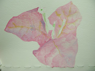
I applied the rose madder genuine to the pink areas using mostly the tip of a no.6 round brush.  As if I'm dabbing spots on and leaving spaces in between.  The pink defines the areas but because they were applied unevenly and spottily, it will help with the illusion of convex textures on the modified leaves' surfaces.

When you apply the second wash over the entire leaf's surface, this will soften any hard edges you may have had in the first step with the spotty paint application. When this layer dries, because we used transparent watercolor, the texture underneath would show but would look more natural.  I also use this second wash to enhance the leaf's bending or foldings.  While the layer is in that state between wet and almost dry (when you tilt it, it still has that sheen or film of water), I drop in warm and cool versions of the local color to enhance the bending effect.  When it is almost drying, (state when you know your next paint application will have a limited spread but will still soften, I would add the yellow ridge lines.  That's because I imagined the central and radiating lines (the leaf's skeleton) to be yellow for this painting.  But if you want it to be another color, use your preferred color to define the leaf's framework.  In the picture, I used a liner brush.  You can see how I am able to add the line but at the same time it is soft enough in some places.  The lost and found lines make for a natural looking painting more than the severely defined lines you see most beginner's tend to make.

When you've finished putting the second layer on, your three leaves should more or less look like this.  Notice specially how on the leftmost leaf, the convex textures are almost forming itself.


After the previous layer has dried completely, I would now work on enhancing some of the shapes that emerged.  For the leftmost leaf, I applied just a slightly darker version of the pink to some of the edges on the "found" textures.  Check out specially the part nearest the flower.  It looked as if a lot of work went into creating the creases but that was just a few additions of defining paint.  Again, try not to use single hard lines but use the broken or "lost and found" line defining technique.  At this point, I've only used the colors rose madder genuine, winsor yellow and cerulean blue.  RMG for the local color.  The WY for the leaf framework (mixed in with a bit of RMG to warm it), CB dropped in on the wet RMG to simulate areas reflecting the sky.  Also a bit of the permanent sap green earlier for the flower stalks.  I started coloring thh right-most flower with a mixture of RMG and WY.

Now we start using Permanent Rose and Permanent Alizarin Crimson.  I start defining the flower stalks using PR mixed in with RMG.  I also used PR to add some defining lines to the leaf skeletons.  Again, use the broken line technique.  And if you're enhancing a previous broken line application, you enhance only 3/4 of that one's length.  The missing parts are supplied automatically by the viewers' brain as it tries to digest what it is seeing.  That's what we're stimulating by the way.  The human brain is a remarkable organ, it is always trying to be efficient.  We are able to process a lot of information because for some tasks, the brain has devised a way to process things faster.  For vision, it stores a lot of information.  We can take advantage of it in painting.  It creates solid lines out of broken lines.  Complete textures on areas.  Even mix colors - something the impressionists realized and took advantage of.   Etc.  Our aim is to stimulate the brain enough so that by the time you finished painting, the subliminal part of your viewer's brain is on hyper mode and it will be hypnotized into thinking this is a busy and stimulating painting... it is beautiful.  I like it.... I want to buy it.  Ok... ok... I haven't figured out how to compel your viewer into buying yet but someday, we'll get there.  (evil laugh!)  :D

As you near completion, you would notice, you're tweaking the painting less and less.  My last touches were made with permanent rose and alizarin crimson. Just minute enhancing on the leaf's skeleton and more definition for the flower stalks.

If this is a painting with a background, my next step would be on how to integrate the bougainvillea into the background.  We'll get to that in future demos.

I hope you enjoyed this one.  Thank you for looking.

Saturday, June 4, 2011

Bougainvilleas

It has been awhile since my last post.  I have been busy the past weeks taking advantage of the last days of the summer.  Very hot days with temperatures reaching as high as 36 degrees Celsius (96.8 F) in the shade.  Despite the heat, many trees and plants are in bloom.  Bougainvilleas are aplenty.  They seem to thrive in the heat.


Fuschia Bougainvillea
KS00081, 8 x 8 inches, watercolor on paper

Common colors of bougainvilleas are white, red, pink, fuschia, lilac, and orange.  The colored parts of the plant are not actually big petals but are specially adapted leaves.  People often mistake these colorful leaves to be the flower.  Not exactly, but close.  The bougainvillea flower can be found at the end of the colored stalk that protrudes from the colored leaf.   Yes, the very small white bloom.   

While the bougainvillea plant looks very chaotic and busy, there is actually an order to things.  People sometimes tell me I'm crazy to want to paint bougainvilleas.  They require so much detailing.  But you know, once you see the logic of its construction, it becomes do-able.  And it does not require as much detailing as you think.  Will do a step-by-step project of it one of these days.

This fuschia bougainvillea is from our backyard.  I hope the orange and the very dark fuschia bougainvilleas my father got for me take root.  We are well into the rainy season now.  I'm seeing more green leaves than colored ones last I checked.  Maybe that is their way of coping with rainy weather.

This painting has been sold.  
Affordable prints of it may be had at FineArtAmerica

To see more of my completed works:

Back to painting now.  Thank you for visiting.    


Wednesday, April 27, 2011

The Right Side Of A Watercolor Paper Roll

"Right Side" is probably the wrong term but that is what many of us use when we search online for instructions on which side of a watercolor paper roll is intended to be painted on.  There is actually no right or wrong side to paint on.  Today's watercolor paper is designed so that both the front and the back surfaces may be used for painting.  One side usually comes smoother or rougher than the other. There is only the matter of preference.  My paper of choice is Arches 140lb cold pressed and I usually pick the side that looks rougher (the side facing inwards) because it has mild properties of a rough paper but still maintains the subtlety of the cold pressed paper.  Never had a problem with it until I opened a new paper roll. 

I was painting plumerias when I noticed something was odd about how my paint applications were behaving.  When I do a more watery wash, the boundaries of it started running in a linear pattern.  I was having a bit of trouble keeping my edges defined and my background was also getting this linear pattern to it no matter how carefully I lay down my washes.  I thought I may have received a defective paper.  I continued the rest of the painting using dry brush just to see if that could be a possible solution for salvaging the rest of the new paper roll.  At the same time, I was searching online if others were having the same problem with new paper rolls.  If it proves to be a batch problem, then there might be hope for a product recall and replacement.  I learned a lot by just reading through the complaints and how the paper maker's company addressed them.  Turns out, sometimes when the felt for the roll presses for the machines are new, they may leave behind a more rougher surface.  This is the reason why some cold pressed watercolor paper may appear rougher than normal.  I wish I took note of all the sites I have been directed to.  But two sites stood out that I found most helpful in making me realize what the real problem was.  I will provide the links at the end of this article under recommended readings.

It was seeing the screen pictures at BruceMacEvoy's handprint.com site that was my first Aha! moment.  The linear marks on my painting could be explained by it.  After I read the article, I felt very very enlightened.
Everything made sense after that.  Second Aha! moment came after reading through Char's article, a compilation about watercolor paper.  Every other article that came up on google would explain the wire and the felt side but never which side of the paper roll the wire or felt side is, only Char's did.

Now I get why the paint was behaving that way.  I have been painting on the wire side all along.  Not only am  I getting the impressions from the felt, but also the linear impressions from the wire.  I don't have a defective paper after all.  But I'm probably being incoherent jumping to the conclusion like that when I'm supposed to be making the explanation easier to follow.  Let me walk you through my epiphanies, thanks to all the online help:

Your basic ingredient when making watercolor paper is plant cellulose.  It undergoes mechanical and chemical treatment that results into it being made into pulp.  Paper pulp, which comes suspended in water, is shaped into sheets by the use of molds (whether the process is handmade or machine-made).  Paper molds are like flat rectangular strainers that drain the water that come with the pulp mixture.  The cellulose fibers left behind are allowed to settle and adhere to each other. That is how you get the shape of the sheet.  There is still water within this cellulose fibers and so either they are allowed to dry by themselves or rollers are used to squeeze the water out and hasten the drying process.  The surface that is facing the mold is called the wire side.  The surface settling against this side will acquire the texture of the wire.    Which is why if air-drying is used, the side facing the wire is still the rougher of the two surfaces.  The settling of the fibers into the mold impresses the texture of the wire or screen into that surface of the paper.  When the roller method is used, the mold with the pulp is sandwiched between two felt sheets before it gets pressed by the rollers.  The wire side now gets its texture not only from the wire but also from the felt sheet it comes in contact with.  The opposite surface, the side that gets in contact with only the felt acquires the descriptive name the felt side.  The newer the felt, the more pronounced the texture it impresses on contact.  Because the felt side receives texture only from the felt, it would appear textured but will appear to be much smoother compared to the wire side.  The side facing inwards of a watercolor paper roll is the wire side.  The side facing outward is the felt side.  If you've pre-cut the paper and are now confused as to which side is facing inwards or outwards, Char's advice would come in very handy.  To determine if the felt side is the side that is up, check the corners.  If they are angling down, you have the felt side up.

Instead of using "right" side as our search word, we should have been using the terms, felt side or wire side.  As both side is usable, you cannot go wrong.   As for me and the linear spread, after a little water loading adjustment, I got my control back.  I like how the finished painting turned out.


Pink Plumerias, Blue Background
10 x 13.5 inches
Collection of Maureen Pascual, U.S.A.


Thank you Char for the big help and also for the tip about terra skin.  I'm looking forward to getting my hands on this new material.  forum thread featuring Charlene McGill's compilation.

Thank you also to Mr. Bruce MacEvoy for creating handprint.com and for sharing what he knows.  Very nice fellow and he does answer his own emails as said in the main page of handprint.com.  Thank you, sir.  Highly recommended readings for those who wish to understand watercolor and the other materials you will be handling when you work with the medium.
Bruce MacEvoy's handprint.com site

Also got a tip from one of the coolest artists that I am following, Mr. Nicholas Simmons:  "I've been buying rolls for years, no problem with either side.  Work larger and small defects won't matter." *  
A very wise observation.  Probably, the clue to very passionate paintings.  You can concentrate more on expression if you do not get too caught up with particulars.  Thank you, sir.
The links to his latest art and book projects can be found in his blog.  nicholassimmons.blogspot.com
* Reposted from his comment to me on facebook.
Also, don't miss out on his video,  Innovative Watermedia.  Out now.


Related articles
How to transfer your drawings to watercolor paper